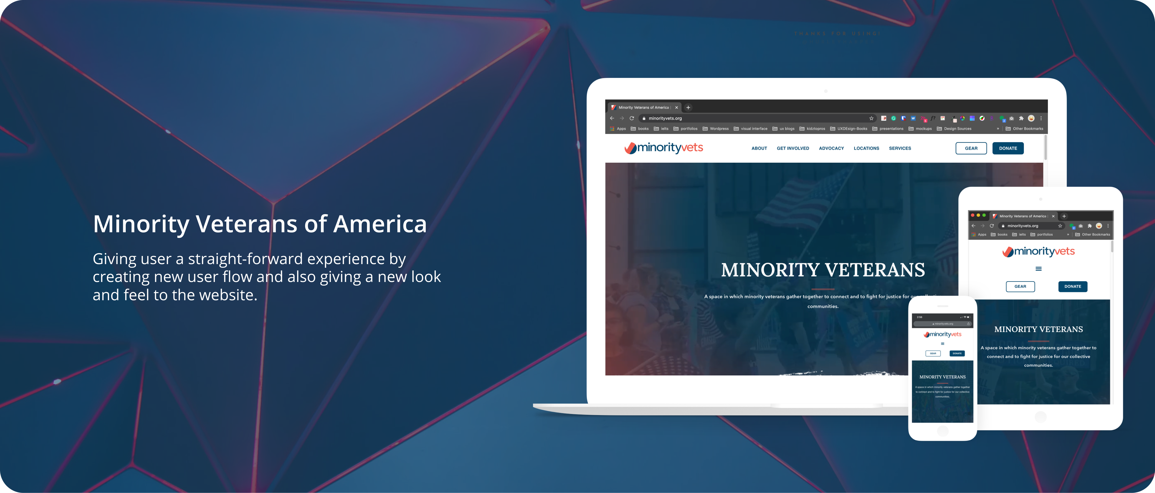
Improving the aesthetics of MVA website
THE PROBLEM
Minority vet’s current website does not capture what they do, the reason behind the organization, and felt haphazardly thrown together.
OVERVIEW
Founded in 2017, Minority Veterans of America (MVA) is a non-partisan, 501(c)3 non-profit organization designed to create belonging and advance equity for underrepresented veterans, including women, people of color, LGBTQ, and religious minorities. MVA aims to transform the narrative of the American veteran.
DURATION
May – November 2020
ROLE
Worked with the MVA leadership team to conduct user research, competitor audits, build user stories, and design, develop, and test the MVA website.
Manager: Cassie E. Gabelt, Communication Manager at Minority Vets of America
WEBSITE
01 Empathizing the Problem
Research
Studying users and website gaps.
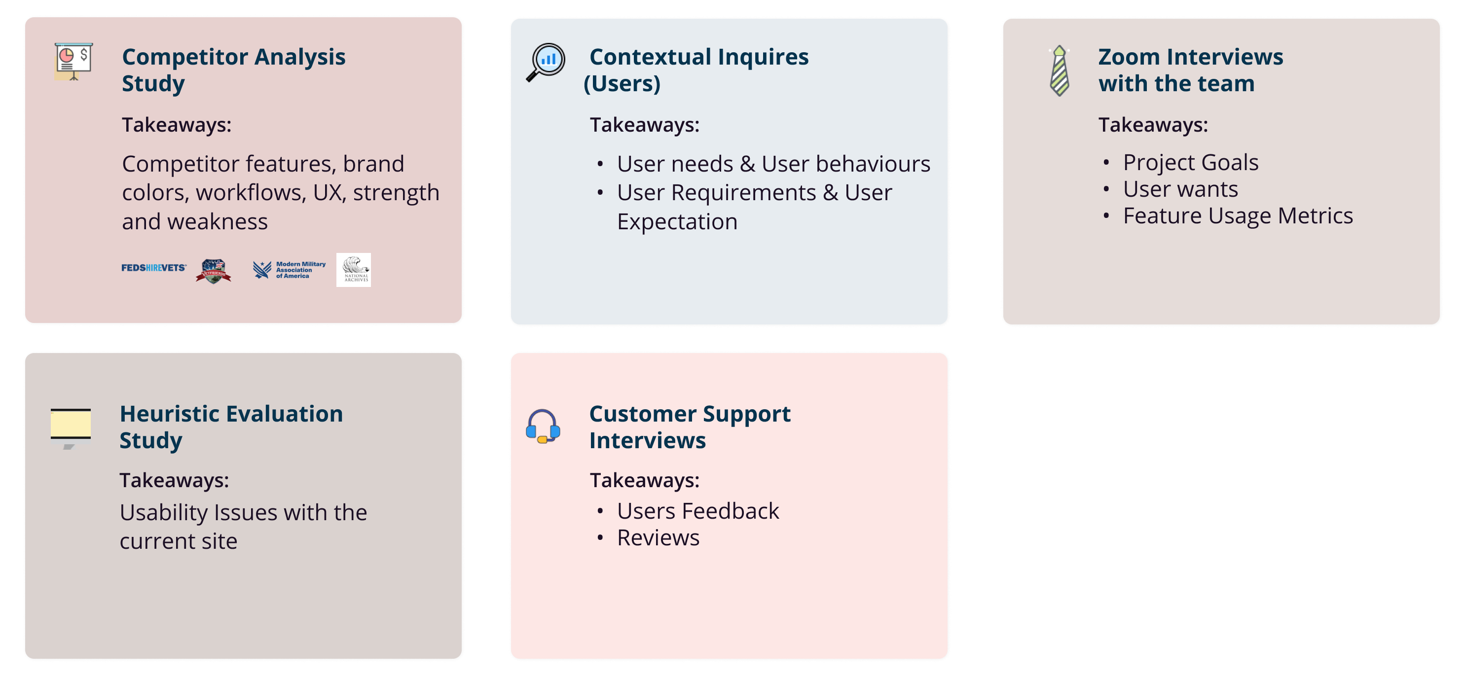
We followed a mixed-methods approach to understand product gaps, users’ needs, and behaviors.
Ping me for more detailed info. I have presented detailed info in the presentation.
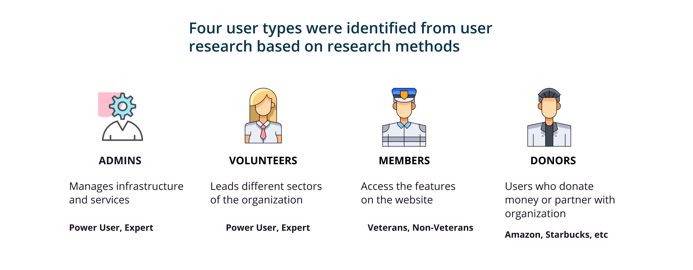
What do we know about our users?
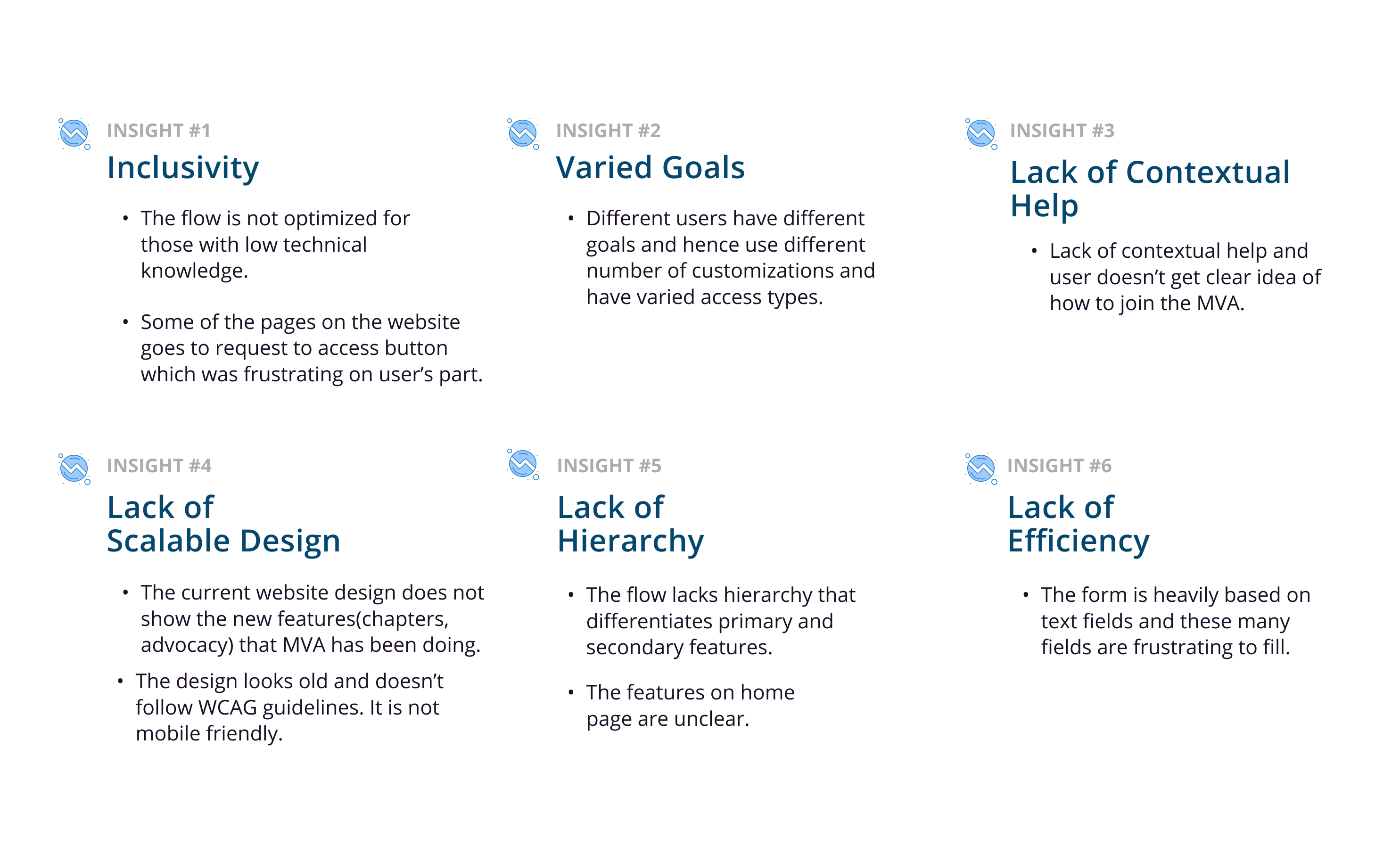
According to the insights, there was a clear idea of who our target demographics were.
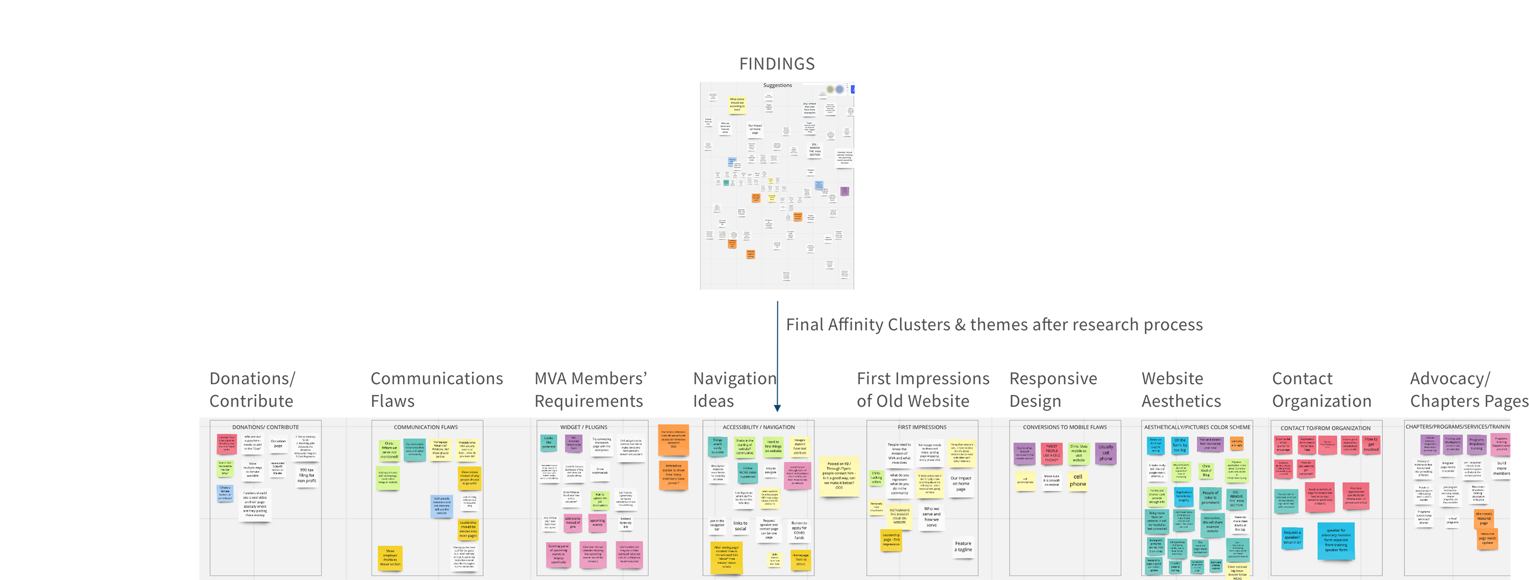
We used affinity mapping to gather all the insights and then formed groups to get a clear understanding of the user pain points.
Key Insights from the affinity mapping
02 Defining the Problem
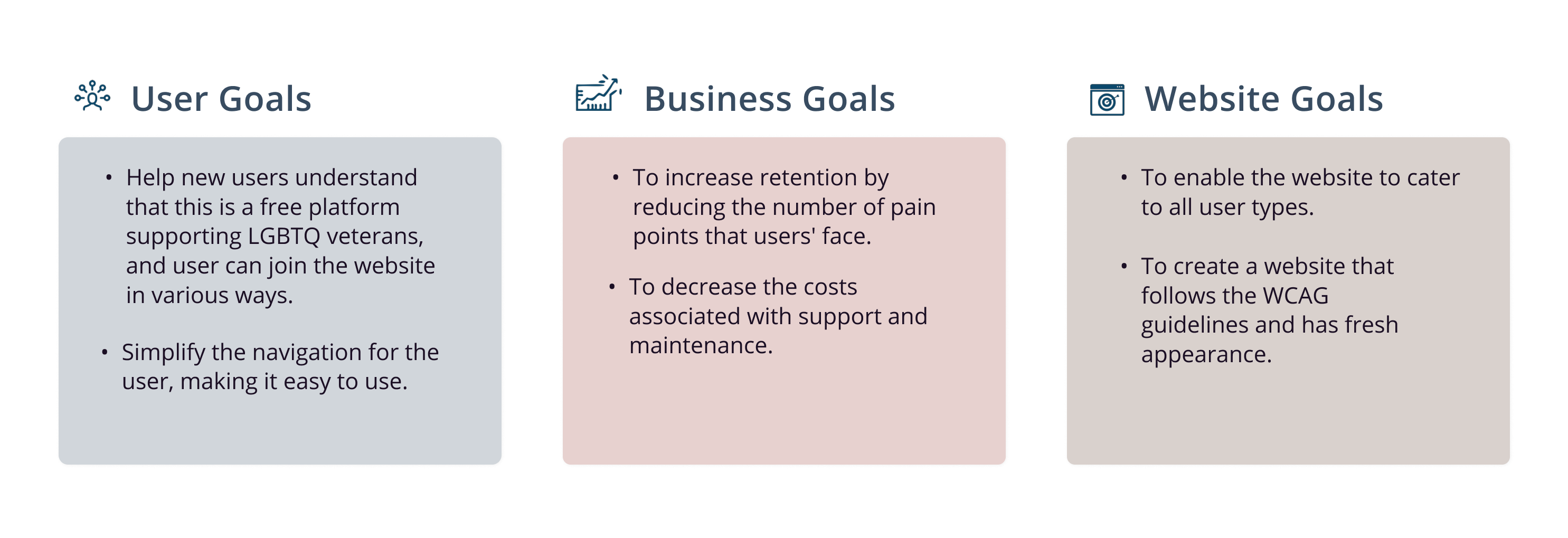
Remerged Goals
User Goals, Business Goals, Website Goals
03 Ideating on how to solve the problem
Ideation Process
How did I work on ideation process?
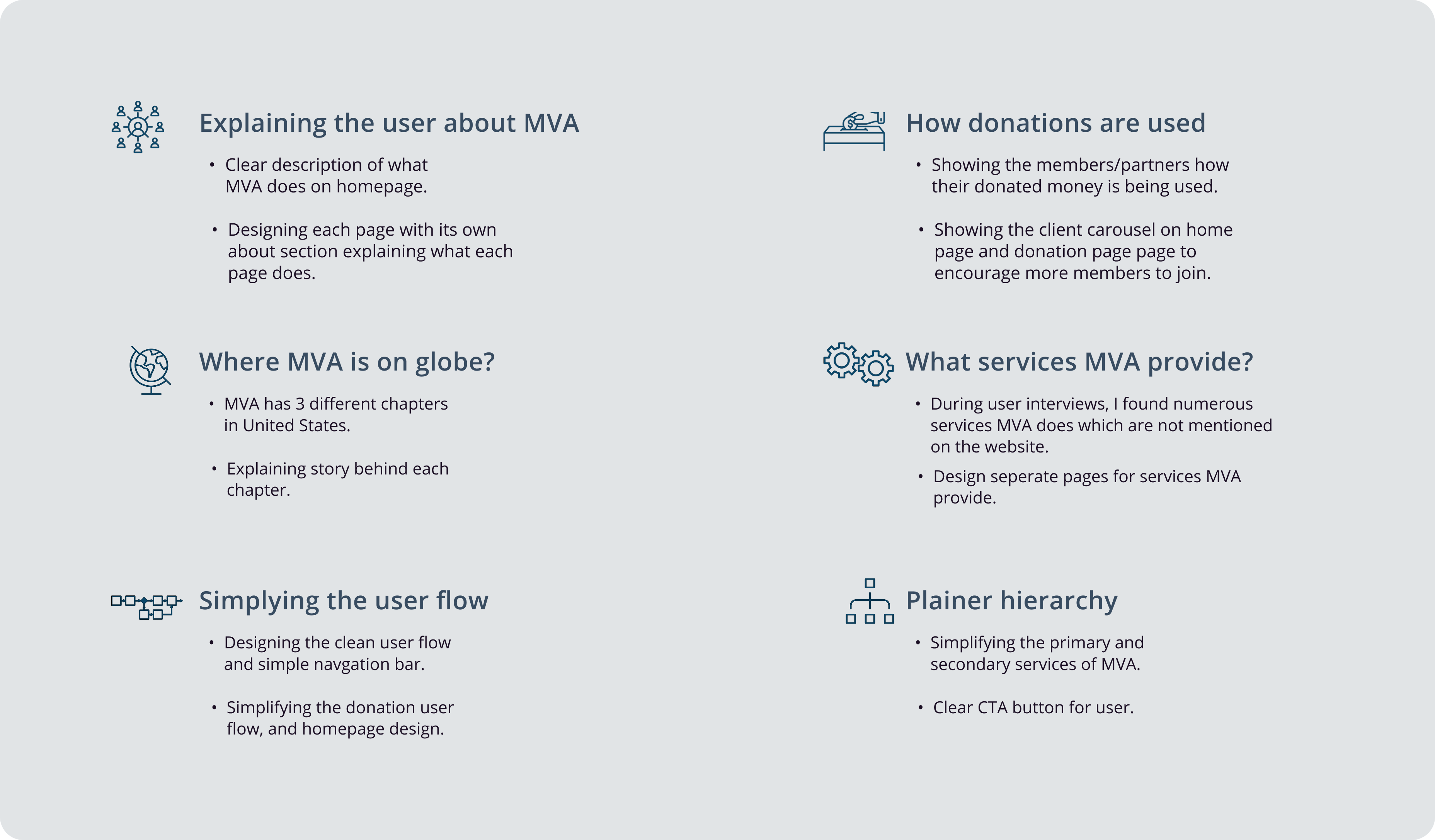
Approaching the HMW questions by converting pain-points to design solutions, improving the site map and improvising the user flow.
1. Finding the design solutions.
I did brainstorming with my MVA team to come up with features that will solve the pain points. We did a quick presentation of which features we are planning and how our features will solve the problem.
Working on all the key insights, I did feature prioritization and worked on converting pain points to design opportunities :
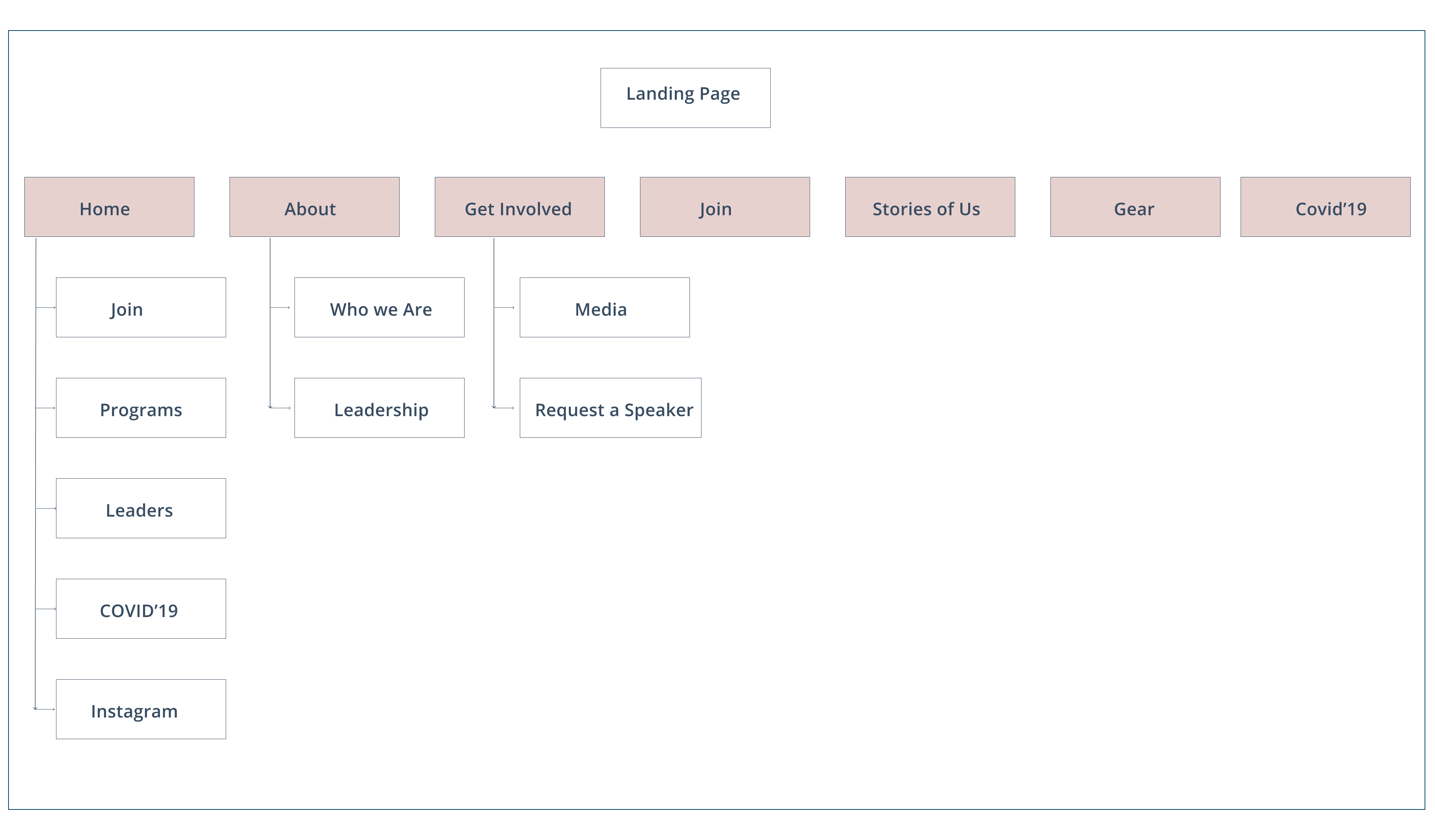
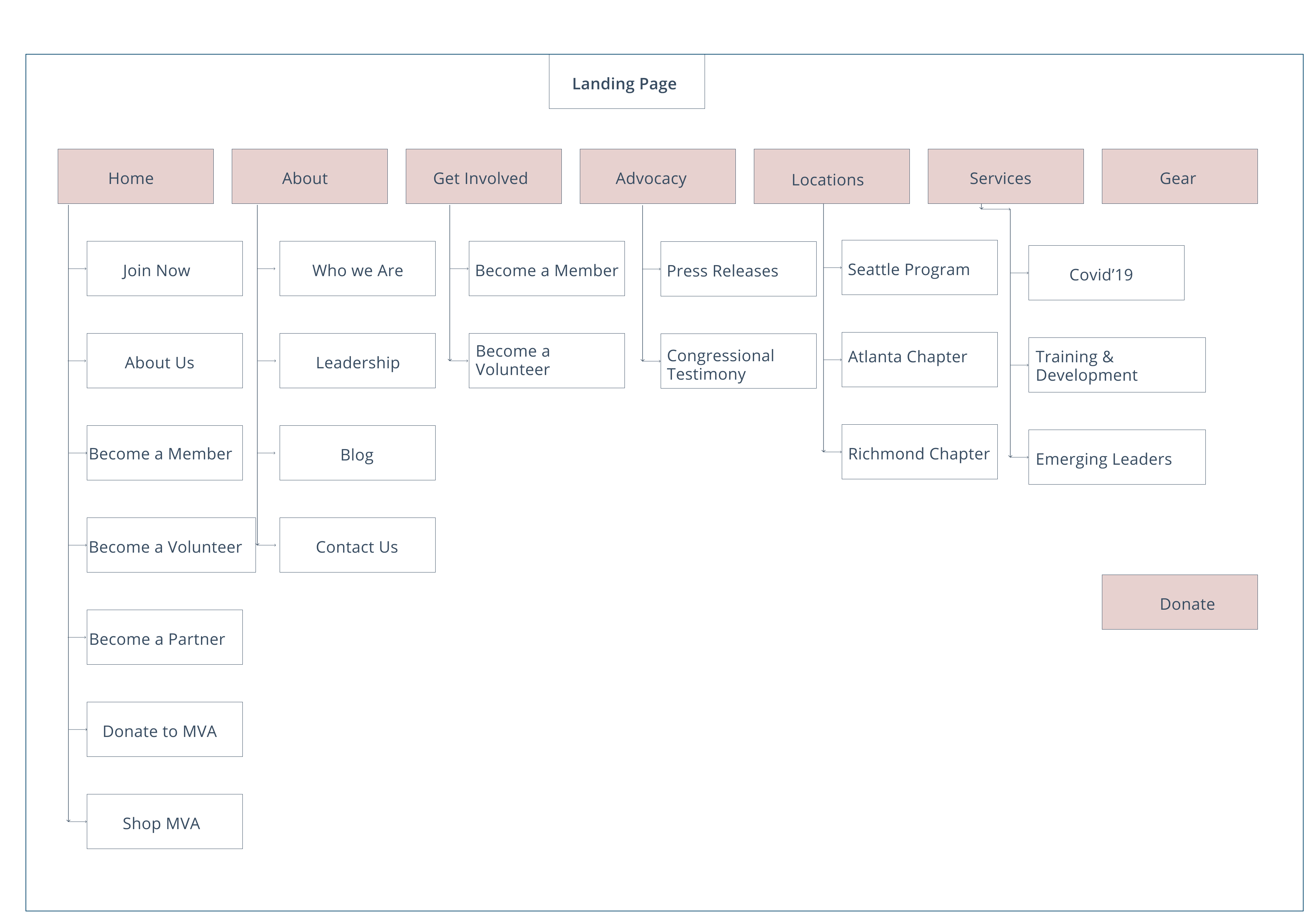
2. Improving the Site map.
I took the old site worked on website pain points and modified the site map.
Solving the pain points and updating the site-map
1. Separate pages- Advocacy, Get Involved, Services, Membership Page.
2. Clean navigation bar for easy access of the website
3. Added the description of each page along with the contact information for more info. This will make it easy for users to learn more about each page.
4. Highlighted the Donate button for easy access
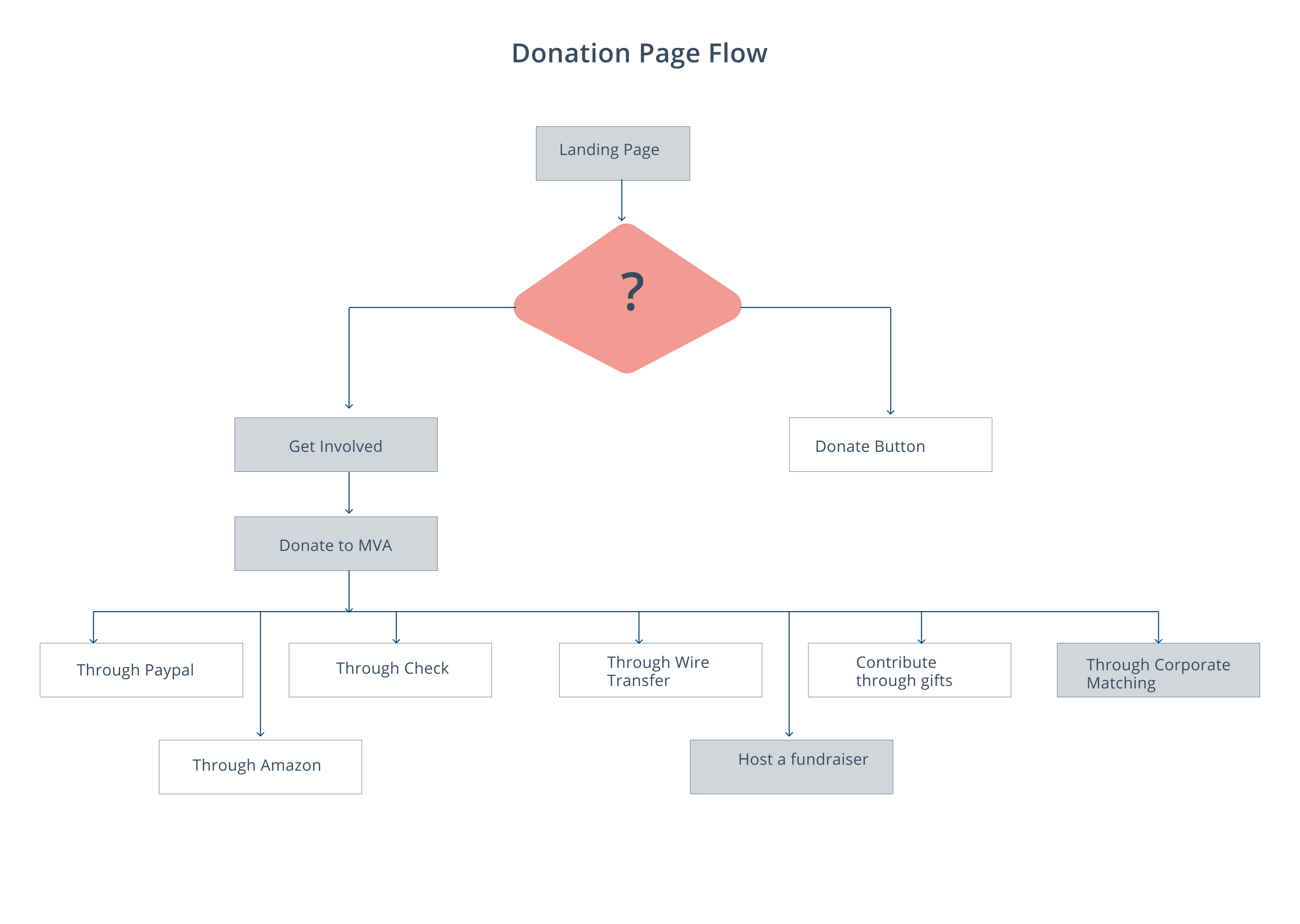
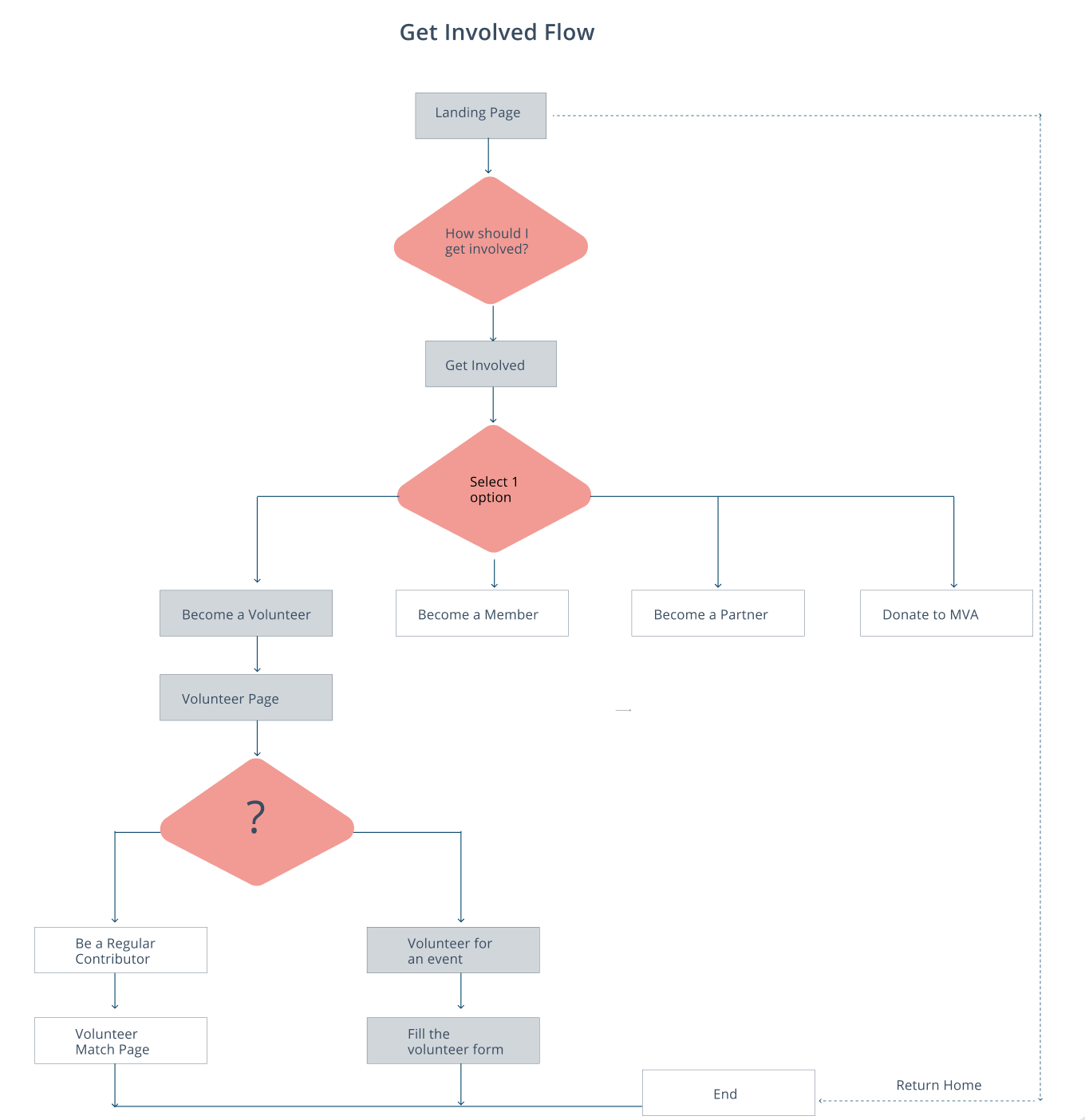
3. Proposed User flow.
Based on the sitemap and the discussion with the users, I combined the reviews and generated user flows.
04 Initial Wireframes, Design Guideline
Initial Wireframes and User Feedback
With how the core features will solve the problem, I designed two initial wireframes of different pages (Home, Donation, COVID’19 and Item Details) to get early feedback from users.
1. MVA Homepage
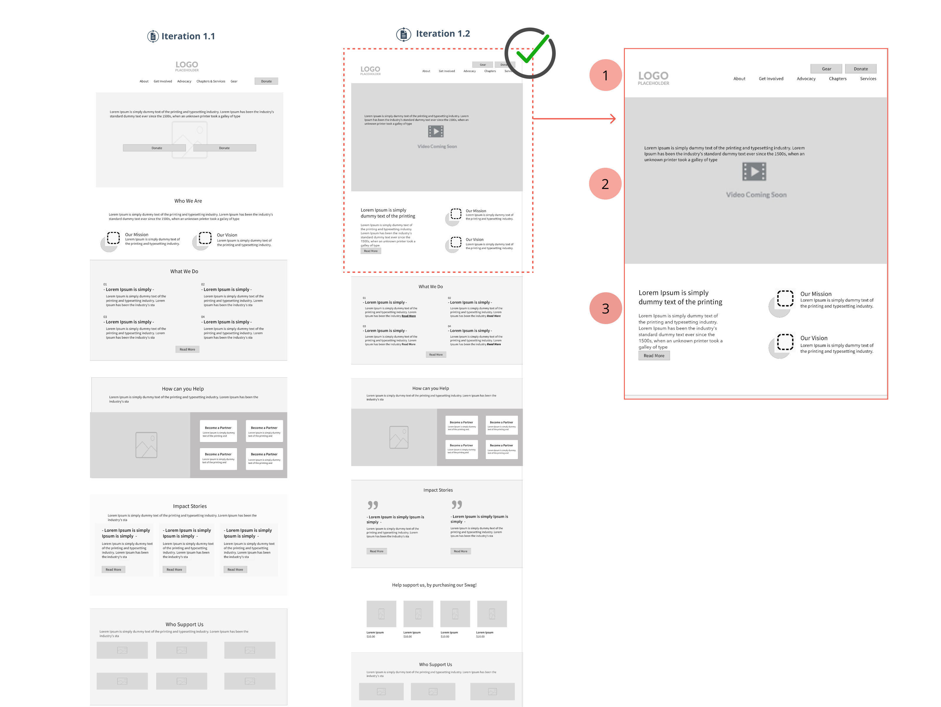
I did iterations on home page and then did the user testing with particular user group and MVA members to understand the design preferences.
Iteration 1.1.
➡️ Highlighting the logo so keeping it in the center, followed by the navigation bar.
➡️ Hero image will be a slideshow, highlighting 2 buttons- Donate and What we Do
➡️ 2nd section shows Our Mission and Our Vision- parallel to each other.
Iteration 1.2
➡️ Designing the simple right side navigation bar. Highlighting the Donate and Gear button
➡️ Starting with the auto start MVA video, helping users to connect with MVA.
➡️ Highlighting Mission and Vision with icons and also describing few lines about MVA
? User Feedback
1. Users could see the Donate and Gear button on the 2nd Iteration while on the other MVA logo was more visible.
2. Users loved the auto video in the front section compared to slideshow as it felt more trendy.
3. Our Mission, Our Vision looked more clear in Iteration 2 due to 2 column format.
Brand Design Guidelines.
Deciding on the colors
My biggest challenge was to incorporate the MVA brand colors on the website by not overwhelming the user. As the MVA color palette has strong veteran colors.
MVA WEBSITE BRANDING
Biggest Challenge
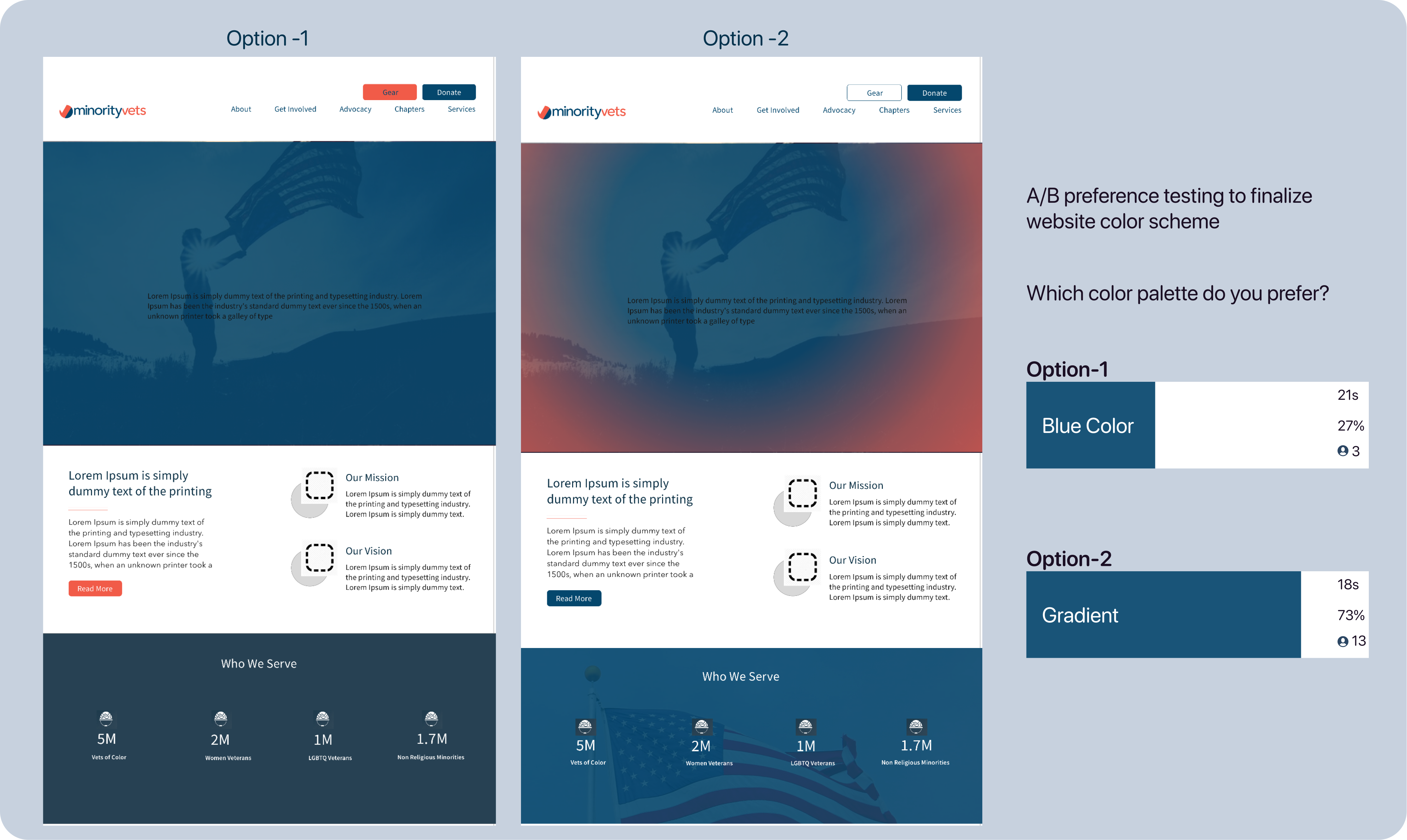
➡️ The biggest challenge was how to give the website a veteran look – my team wasn’t sure if we wanted to maintain an analogous or a complementary color scheme.
? I decided to do several color studies with our mid-fidelity wireframes to test different color schemes & combinations.
? We then sent these off using the usability testing tool to get other people’s opinions on the color scheme. The high contrast and vibrant blue-red gradient color scheme were more preferred, which is the color scheme we decided to go with.
Ping me – if you want to see the different screen iterations and detailed design system I created for Minority Vets
05 Explaining design decisions and User testing
HOME SCREEN
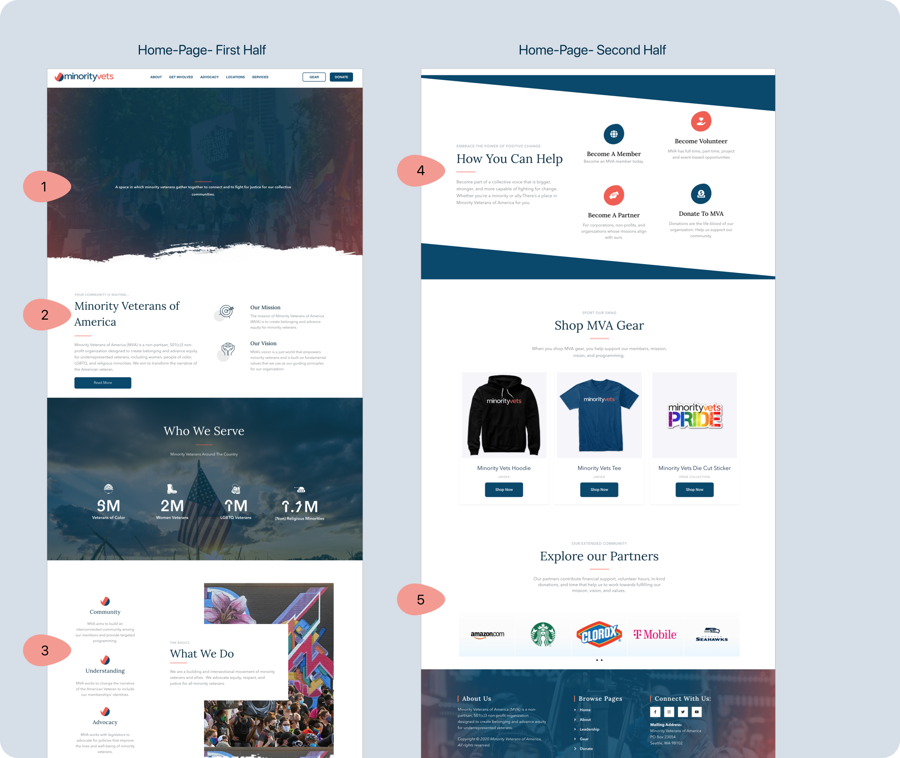
Clean navigation bar highlighting Donate, Gear button
➡️ Problems Solved
? 1. To give a more trendy look by replacing the hero image with the MVA video. Animated text in headings.
? 2. Explaining to the user at first glance what is MVA and about its mission and vision.
? 3. Showing the impact of the organization by showing a number of people.
? 4. Clear representation on how to get involved with the organization.
? 5. Horizontal slideshow of Partners and Donors with their name and logo
DONATE PAGE DESIGN
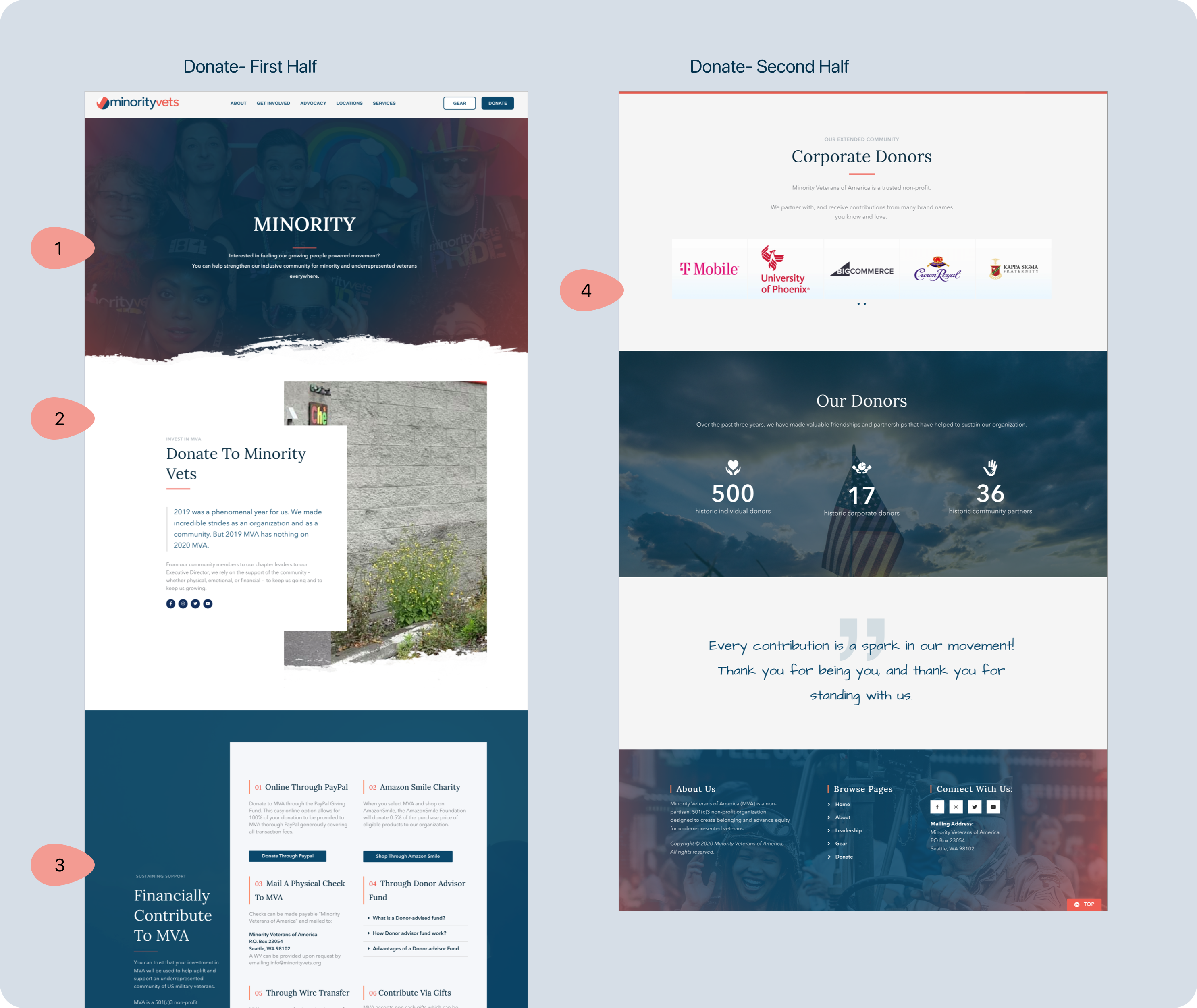
Clean distribution on how a user can donate to MVA
➡️ Problems Solved
? 1. Animated text in headings. A text line to explain user what this page is about.
? 2. Explaining the user at first glance what to expect from this page. Giving a parallax effect to image.
? 3. 8 ways of how a user can donate to MVA. Brief description on how to done through each way.
? 4. Horizontal slideshow of partners that are involved with MVA to build trust among users.
User Testing & My Learnings
I did user testing with target users to understand the positives and negatives of the website.
? Positive Feedback.
1. Participants had a fairly straightforward experience using the new MVA website.
2. They found the icons to be clean and inviting.
3. Participants liked to see the clear way of donating to MVA and what they do, how do they use the donations.
? Feedback to improve.
1. Participants had a hard time with the “Press” page because they didn’t know the concept behind it.
2. Minor UI changes to make (icons, buttons, etc.)
3. Some issues with the submission of the Contact form.
My Learnings.
? * I loved working on a project with a real client and real stakes. It made me a better designer to take client needs into account, practice advocating for user needs, and have to document the details of my designs for a future use.
? It was immensely helpful to create a style library before prototyping. Having those components already defined made prototyping a fast and consistent process. I was also able to easily edit and add to the style library as I iterated my designs.

